

This is really cool. I install extensions to remove the Activities button and display a workspace indicator.
A lot of Workspaces might present a problem though. Currently, the Workspace indicator extension with collapse into a number after 8, or so, and I’m not sure how that scenario would work with the proposal.
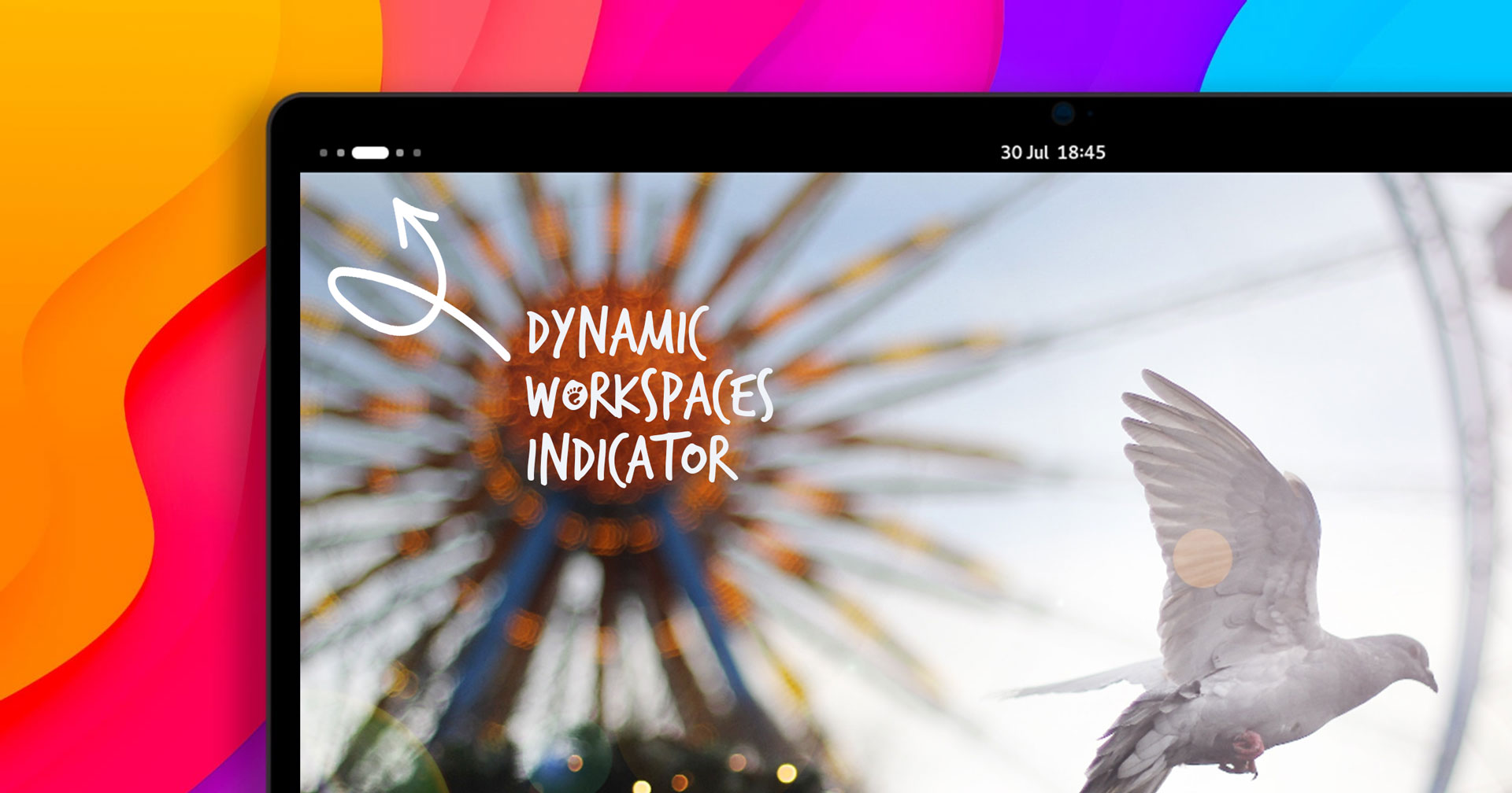
Btw, they released it as an extension.
It seems more and more that the GNOME extension ecosystem is going to make it more customizable than Plasma one day
From my experience so far it’s more like installing gnome extensions just to get a fraction of the customization of stock kde, and I don’t really see that changing any time soon.
That seems l like a fine addition, although visually an explicit number being shown would be enough and even better imho.
Well, I’m trying it out and I gotta say… I just don’t care.
I mean, it looks nice, and I guess the extra info is good. On the other hand, I weirdly miss the word in the corner. On the other, other hand, it’s such a small change I can’t imagine getting upset about it if it became the default.
So… Yeah. Whatever’s clever, Gnome team. I’m happy either way.
On the other, other hand, it’s such a small change I can’t imagine getting upset about it if it became the default.
Haha, more folks should have this attitude.
I agree. I saw someone said something along the lines of “kill it with fire” an all I could thing was that sounds like a lot of effort for a couple dots in a corner.
Configurability is the answer. Some people like it some don’t, just have a setting to turn it off and it’s fine
Personally I don’t see much point in it as I just use the three finger swipe anyway, too much effort to mouse up to the top left and click it then navigate a GUI compared to just swiping left and right
Hmm, I wouldn’t like having such a setting cluttering up my settings panel. Maybe they could allow the user to configure whether they want such a setting?
It’s not a terrible idea… I actually use the mentioned Space Bar and really like it (makes me miss i3 less :)).
Why’d you switch from i3? If it was for Wayland support, in case you didn’t know, the Sway window manager is basically a drop-in replacement for i3, but for Wayland rather than X11. You can literally copy/paste your i3 config into ~/.config/sway/ and it will only need a few minor tweaks to get fully working!
I just made the switch this past week. The one caveat is Polybar doesn’t work correctly with Sway, so I had to configure Waybar instead. Waybar has some cool features though, like being able to place the tray anywhere you want, so it was worth the effort to switch.
I don’t use Wayland at all, though I am aware of Sway.
I switched to Pop and GNOME because… for lack of better phrasing, I wanted a more normal experience that I could recommend others. I used Void and i3 for about 6 years (Arch + i3 for years before that) and just wanted something I could recommend to new users and support them as well (hard to support something I don’t use myself). Pop and GNOME with the tiling features is a happy medium for me. Far from perfect, but good enough.
deleted by creator
Literally never use the activities button. Happy to see it go.
Still a piece of garbage. Can’t they simply admit they were wrong and add a permanent panel with icons (like Windows or Mac) at the bottom of the screen and move on?
Eh, I used to think this way until I actually tried GNOME for a bit. I’ve grown quite fond of its workflow. There’s definitely extensions that I feel I need for it to be fully usable from my perspective, but in some ways I see it as a positive to start out with a good foundation and then allow users to extend the functionality they feel they need onto that base. Not every user is going to want the same thing, so keeping the core minimalist makes sense.
If I wanted something like Windows, I’d use KDE. If I really wanted a GNOME Windows-like experience similar to the old GNOME2 behavior I’d use something like MATE or Cinnamon. I guess my point is that there’s plenty of DEs out there that are essentially copies of the same workflow. I respect the desire to innovate in GNOME3.
Use the dash to dock extension
I mean if oyu don’t like it, then don’t use it or install an extension. I never missed a bar at the bottom and can find all open windows in the overview very quickly
Yes but extensions work to a degree and not out of the box. For instance, when they abandoned desktop icons a long time ago we never had and extension that delivered the same polished experience.
GNOME has some quite strict design guidelines (a “vision”, if you will). And sticking to that a vision has enabled them to create a very polished DE (probably the most polished DE on Linux). What people get wrong is that GNOME wasn’t really made for desktops. It was made for mobile devices (laptops, tablets, and in the future phones). Using GNOME on a “proper” mobile device really makes sense. No, that doesn’t mean using a laptop connected to an external monitor all the time, or just using it at a desk all the time. It means using a laptop as a laptops, going out and about, using it without a mouse and using it with it’s internal display.
I can’t agree as I love Gnome and now feel lost when I have to use windows or MacOs. The way it uses the workspace and the way your screen isn’t cluttered with informations is great for someone like me.
And extensions are there to help you with almost every limitation you encounter.
You don’t like your LEDs blinking Morse code of your 1s average combined CPU load?
Or just you can use a different de and move on?
@TCB13 @thegreenguy I prefer it the way it is. If you love the Windows design so much, just use KDE.
No, KDE is even worse than GNOME. GNOME has some sense of design and things are properly designed most of the time, consistent spacing between elements and whatnot, KDE fails on that. GNOME fails on providing a basic desktop experience to those familiar with Windows and macOS.
They weren’t wrong. There is no need for a panel, you can just type what program you want. It’s not year 2000 anymore.
Besides, Plasma is much more like Windows. It has panels, lots of windows and bugs.
Besides, Plasma is much more like Windows. It has panels, lots of windows and bugs.
On that we can agree. And let me add more: inconsistent design.
Ironically, typing the name of the program you want is a 1970s thing.
you can just type what program you want. It’s not year 2000 anymore.
Yes ironically desktop environments “revolutionized” computing by not having a way to type what program we want to then, after decades re-introduce that :D
Yep, because we realized the pointy clicky hand-eye coordination paradigm is often not an improvement.
Good response to be honest. :)